"I need to know exactly what I'm spending before I commit."
Goals
- Stay within a fixed budget
- See every cost upfront
- Plan without juggling apps
Frustrations
- Hidden fees at checkout
- Hard to estimate the total
- Too many options, no guidance
A travel booking app designed for budget-conscious travelers who want to explore without the anxiety of overspending.
The Problem
Traditional travel booking platforms offer endless options but don't help users stay within budget. Travelers struggle to balance the cost of flights and accommodations while still planning a memorable trip - leading to either overspending or planning paralysis.
The Goal
Design a mobile app that helps travelers set a realistic budget upfront and discover trips that fit within it - combining flights, hotels, and packages into one clear view so users can plan confidently, without the fear of overspending.
Competitor Analysis
Booking, Expedia, and TripAdvisor each do something well - but none help users stay within budget from start to finish.
Opportunities Identified
01
Replace dense filter interfaces with streamlined comparison that surfaces the most relevant options by budget, reducing decision fatigue.
02
Move beyond overwhelming filters to guided, insight-driven experiences that prioritize clarity over raw listings.
03
Reduce cognitive load by prioritizing total cost, key amenities, and deal quality over exhaustive detail.
User Research · 5 interviews
01
Unexpected costs aren't accounted for upfront. Users adjust budgets on the fly, creating stress throughout planning.
02
Too much information makes balancing quality vs. cost hard. Users bounce between apps comparing options.
03
Surprise charges at checkout make users feel deceived. No true total cost before committing leads to abandonment.
Personas
"I need to know exactly what I'm spending before I commit."
"I'm tired of apps that waste my time with irrelevant options."
User Flow
Define total trip budget upfront.
Browse trips that fit within budget.
Full cost breakdown, no hidden fees.
Complete booking with transparent pricing.
Navigation & Structure
Design decision
Budget setup is a primary navigation item, not buried in filters - so every journey starts with a clear spending limit, the top priority our research surfaced.
User Journey Map
Discovery
🤔"Can I actually plan a trip within my budget?"
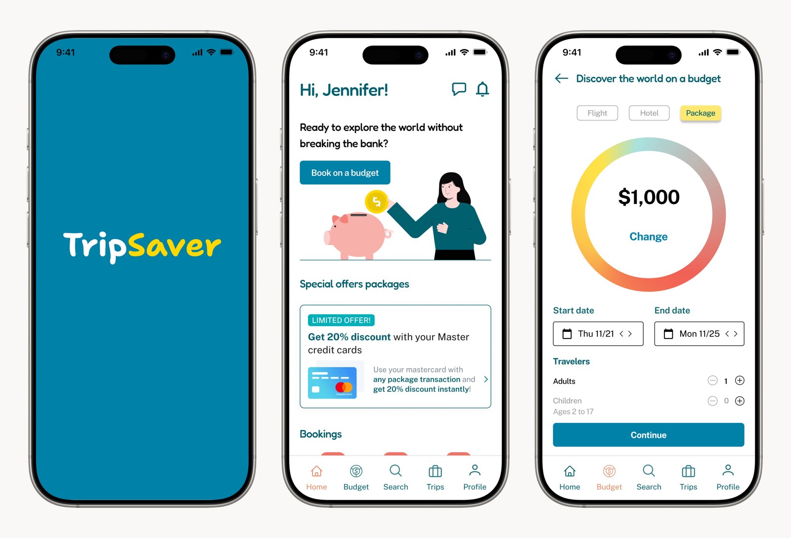
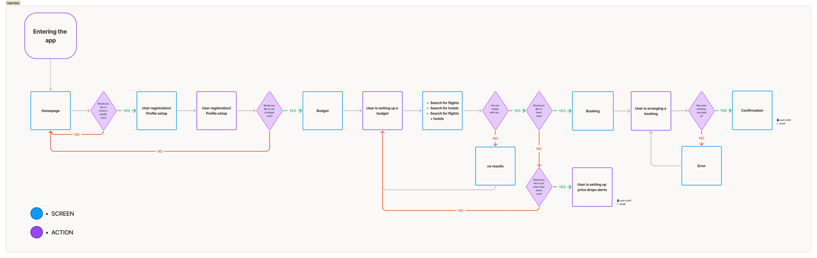
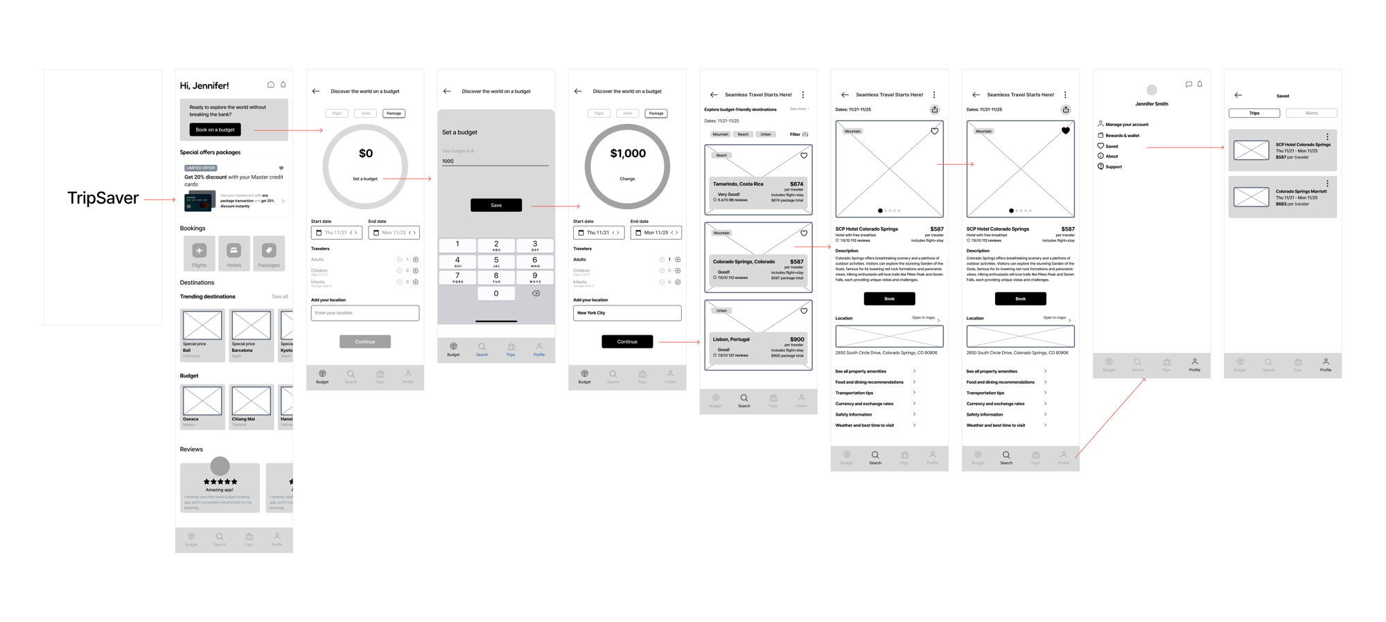
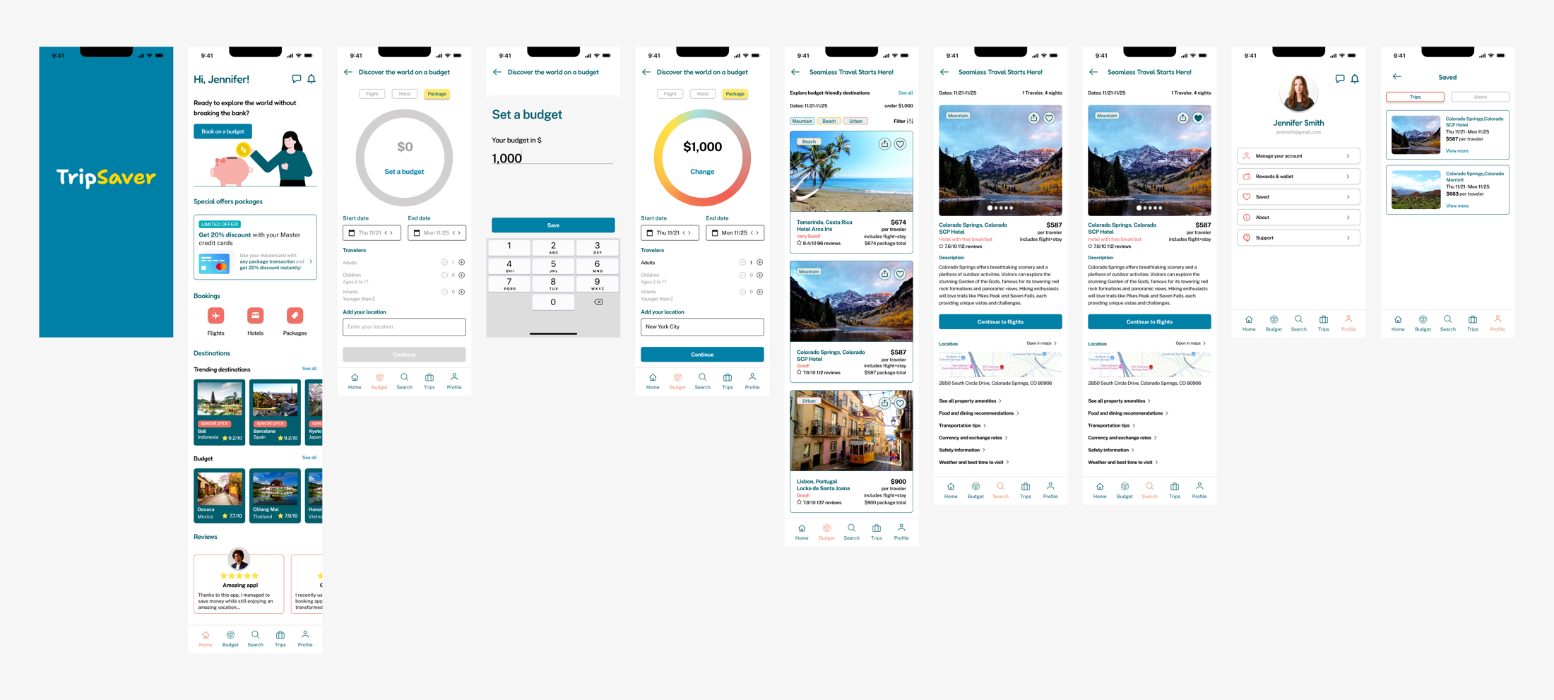
Opens the app, discovers the budget-first approach.
Curiosity
Exploration
🙂"These options actually fit what I can spend."
Sets a budget, browses matching trips, compares options.
Cautious optimism
Decision
😄"I can see exactly where my money goes."
Reviews the cost breakdown, evaluates the best options.
Relief
Booking
🤩"No surprise fees - this is the real price."
Selects a trip, pays with fully transparent pricing.
Confidence
Confirmation
😍"That was so much easier than other apps."
Receives confirmation with the full itinerary.
Delight
By front-loading budget transparency, the emotional curve stays positive throughout - the deliberate opposite of competitor journeys, where anxiety peaks at checkout.
Low-Fidelity Wireframes
Branding
#0081A7#FFD700#F16055Blue conveys trust and reliability, yellow captures the excitement of discovery, and red adds energy to key actions.
Fredoka - soft, rounded shapes for a friendly, approachable headline tone.
Public Sans - modern and highly legible, adding clarity to body text and UI.
High-Fidelity Wireframes
Design Iterations
Price was buried below the image and description. No cost breakdown was visible, so users scrolled past without registering the total.
Total price shown prominently with an "all fees included" badge, a tappable cost breakdown, and a budget-impact indicator showing remaining budget.
Cluttered background and illustration colors that clashed with the palette; small text and a low-emphasis call to action.
Cleaner background, illustration colors aligned to the brand, larger text, and an enlarged CTA with clearer information.
Usability Testing
Key Insight
The budget-first approach - the most unconventional decision - tested as the strongest feature.
Interactive Prototype
The prototype runs the complete journey - budget setup, trip discovery, the cost breakdown, and booking confirmation - with every micro-interaction and transition in place.
Learnings
01
The most impactful decision wasn't a clever interaction - it was showing the real price upfront. Trust is built through honesty in the data you present.
02
Starting with "how much do you want to spend?" instead of "where to?" served most users better, and became the strongest differentiator.
03
Users don't want fewer options - they want fewer decisions. Curated results within a budget removed the cross-app comparison load.
04
The budget slider went through many iterations. Tackling the hardest component early meant the rest of the design flowed from it.