Redesigning with purpose: a responsive web experience for a dog daycare struggling with branding, navigation, and a missing online booking system.
Role
UX/UI Designer
Timeline
6 weeks
Tools
Figma, Maze, Miro
Platform
Responsive Web
Team
Solo designer
The Problem
The site had inconsistent logos and colors that disrupted visual hierarchy, poor information architecture, no online booking system, and testimonials buried on a separate page that required clicking through each review individually.
The Goal
Redesign the site as a responsive, trust-driven experience - fixing the branding, simplifying navigation, adding online booking, and making testimonials and social proof easy to find for new and returning customers.
Reviewing the Existing Website
Before designing anything new, I audited the current site.
I studied what was working, what was broken, and where users were struggling most - so the redesign could fix the right problems.
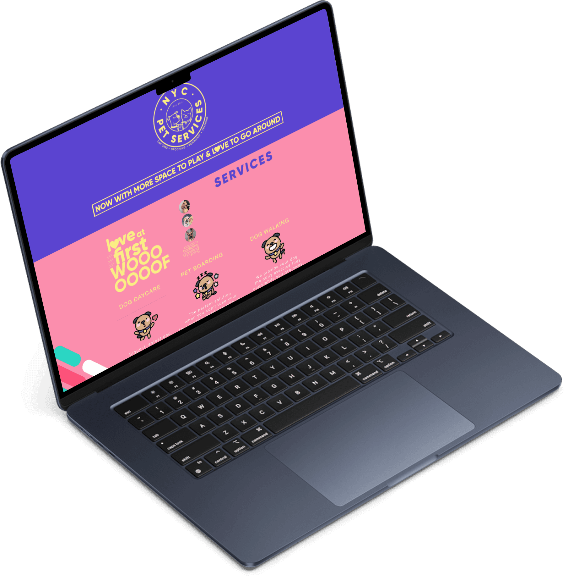
The existing site - inconsistent logos, excessive color, and no clear path to book.
Key issues identified
01
Branding inconsistencies
Inconsistent logos and excessive color usage disrupted hierarchy and made the site feel unprofessional and untrustworthy.
02
Poor information architecture
Inefficient layout, confusing navigation, and misaligned buttons and text throughout the site.
03
No online booking
Users had to call or email to reserve - inconvenient, especially for after-hours bookings when the business was closed.
04
Inaccessible testimonials
Reviews required clicking through one at a time, and none appeared on the homepage where they could build trust.
Competitor Analysis
I analyzed three NYC pet-care competitors.
Dogma, Pups Pet Club, and Animal Loving Care each do something well - but each leaves clear gaps in booking, pricing, or social proof.
Dogma
Pups Pet Club
Animal Loving Care
Strengths
Strong brand identity with consistent visual design
Clear service descriptions with transparent pricing
Testimonials prominently displayed on the homepage
Strengths
Engaging visual content with facility photos and videos
Active social media presence building community trust
Well-organized service categories
Strengths
Simple, straightforward navigation structure
Detailed service pages with clear information
Established local reputation with loyal customers
Weaknesses
No online booking - requires phone or email to schedule
Limited mobile responsiveness across key pages
Weaknesses
Unclear CTAs - booking and contact actions are buried
Pricing information not easily accessible
Weaknesses
Outdated visual design that undermines credibility
Reviews and testimonials difficult to find
Key Findings
Trust is won with branding, surfaced social proof, and 24/7 booking.
01
Brand visibility drives trust
Competitors with clear branding, testimonials, and social proof immediately felt more credible. Consistent visual identity was a key differentiator.
02
Navigation simple but incomplete
Most sites were easy to navigate, yet key functionality - booking and contact forms - was often missing or buried deep in the site.
03
Social proof inconsistently surfaced
Reviews and testimonials exist, but placement and emphasis vary widely, reducing their impact on building user confidence.
User Research · 5 interviews
Three pain points came up across every interview.
I ran remote interviews with five target users - frequent travelers and active pet owners - about their pet-care routines, challenges, and priorities when choosing a daycare.
01
Absence of online booking
Users had to call or email to make reservations, leading to longer wait times and inconvenience - especially for after-hours bookings. A 24/7 online booking system would solve this.
02
Unclear pricing information
Unclear pricing made users hesitant, and hidden fees were a concern. They compare prices across daycares and leave for competitors with more transparent pricing.
03
Hard-to-access reviews
Reviews were difficult to find and engage with. Users rely heavily on social proof - testimonials, ratings, and photos - but these need to be easy to reach on the homepage.
Personas
Two NYC pet owners with different needs.
R
Rachel28 · Marketing Manager · Manhattan
The Busy Professional
"I need to book quickly and know my dog is in good hands without spending hours researching."
Goals
Quick, easy online booking
Transparent pricing
Reviews & staff info before committing
Frustrations
Having to call to book
Unclear pricing
No easy way to see photos or reviews
J
James34 · Software Engineer · Brooklyn
The Cautious Researcher
"I want to feel confident the daycare is safe and reputable before I leave my pet there."
Goals
A trustworthy daycare with strong reviews
See the facility and staff
Understand all costs upfront
Frustrations
No facility photos or staff info
Hidden fees
Testimonials buried deep in the site
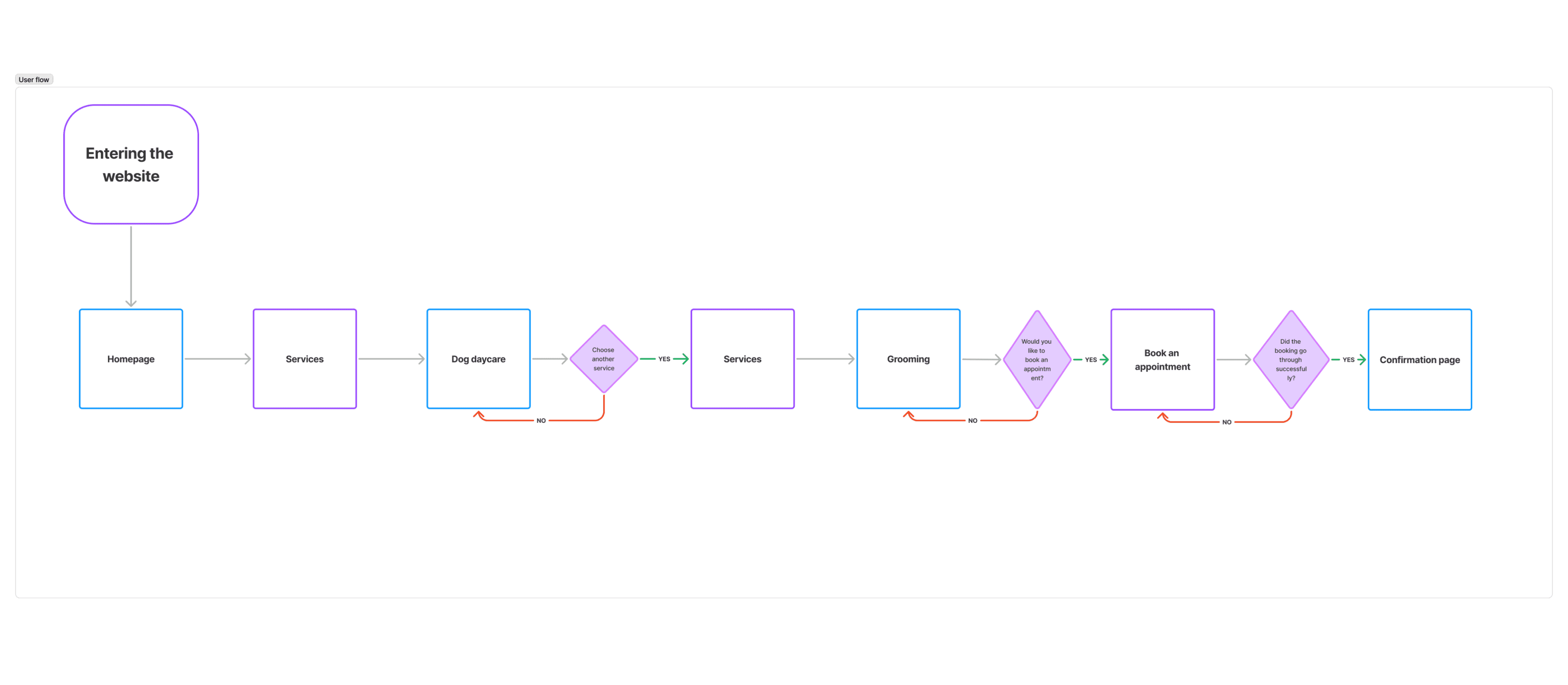
User Flow
Mapping the path from discovery to booking.
I mapped out the steps dog owners would take to discover and engage with services - making sure the process was simple, intuitive, and seamless from the first visit to a confirmed booking.
The booking-first user flow, from landing to confirmation.
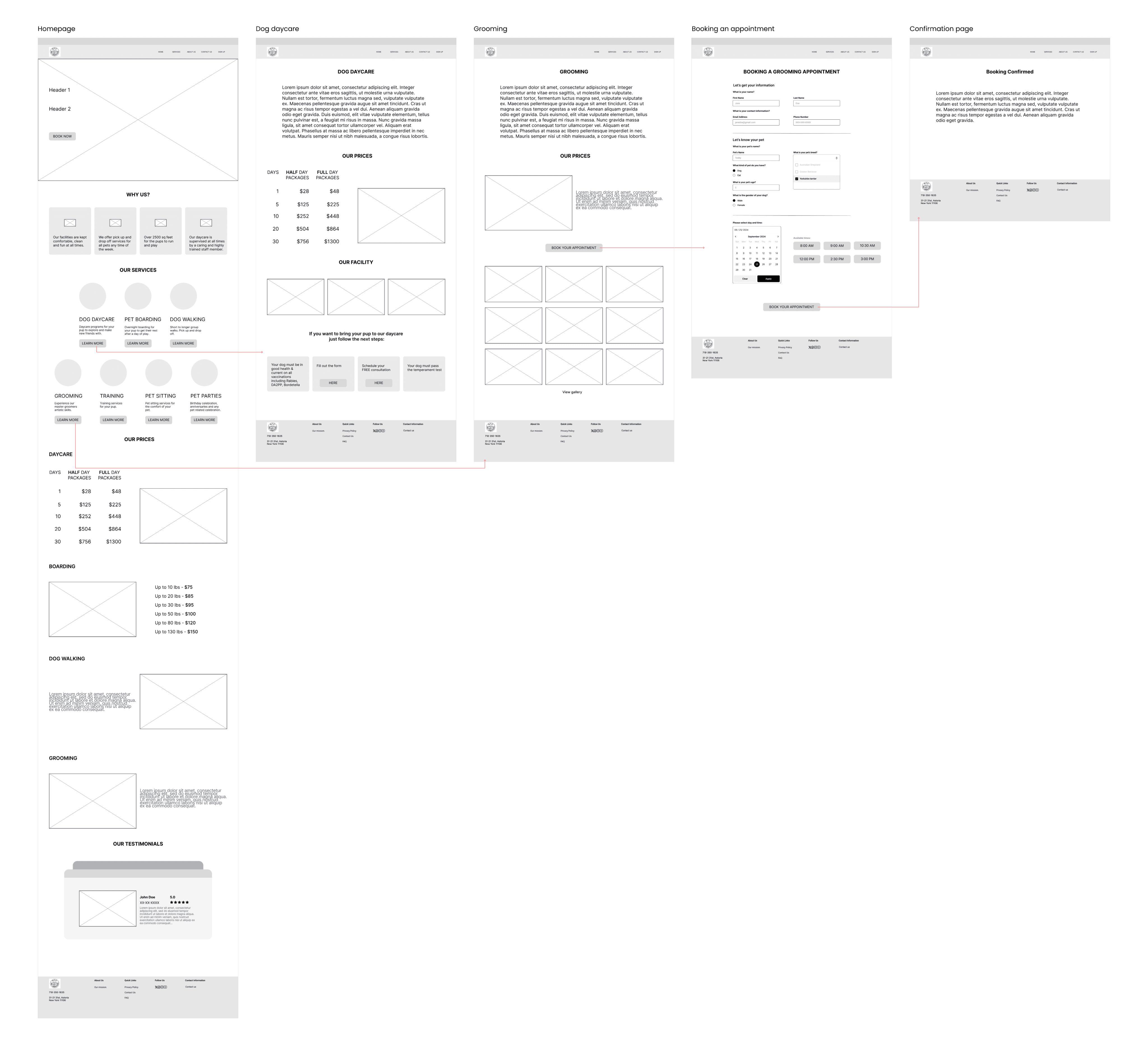
Low-Fidelity Wireframes
Testing the structure before adding visuals.
I created initial wireframes focusing on layout and functionality for the key screens - homepage, service pages, and the booking flow - to validate the information architecture before moving on to visual design.
Low-fidelity wireframes for the homepage, services, and booking flow.
Why the Website Needed a Redesign
Beyond UX, the visual design was undermining trust.
A thorough review revealed problems across layout, color, typography, and accessibility - issues that made the brand feel unprofessional before users even read the content.
01
Inefficient layout and structure
A disorganized layout with misaligned buttons and text. Content was scattered without a clear visual hierarchy, making it hard for users to scan and find information.
02
Too many colors
Excessive, inconsistent color usage disrupted the visual hierarchy. Inconsistent logos and clashing palettes made the brand feel unprofessional and untrustworthy.
03
Readability issues
Inconsistent fonts, small text sizes, and tight line heights made content hard to read - especially on mobile devices.
04
Lack of accessibility
Insufficient color contrast, missing alt text, and no keyboard navigation support limited usability for visitors with different needs.
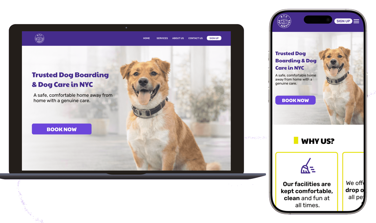
Branding
A cohesive identity built on care, trust, and energy.
Color
#452C8C
#E5E500
Purple represents trust, professionalism, and calm; yellow symbolizes happiness, warmth, and energy.
Typography
Paytone One - a bold, friendly display face for headlines and the refreshed logo.
Clear, high-contrast button styling to make the primary action unmissable.
Usability Testing · 15 participants
The redesign tested as clearer, more credible, and far easier to book.
I ran remote usability testing with 15 participants, focusing on the booking experience and the overall visual design.
87%
completed booking unaided
93%
found the design appealing
15
participants tested
Key Insight
The rebrand and surfaced social proof did the heavy lifting - participants trusted the redesigned site far more than the original, even before they reached the booking step.
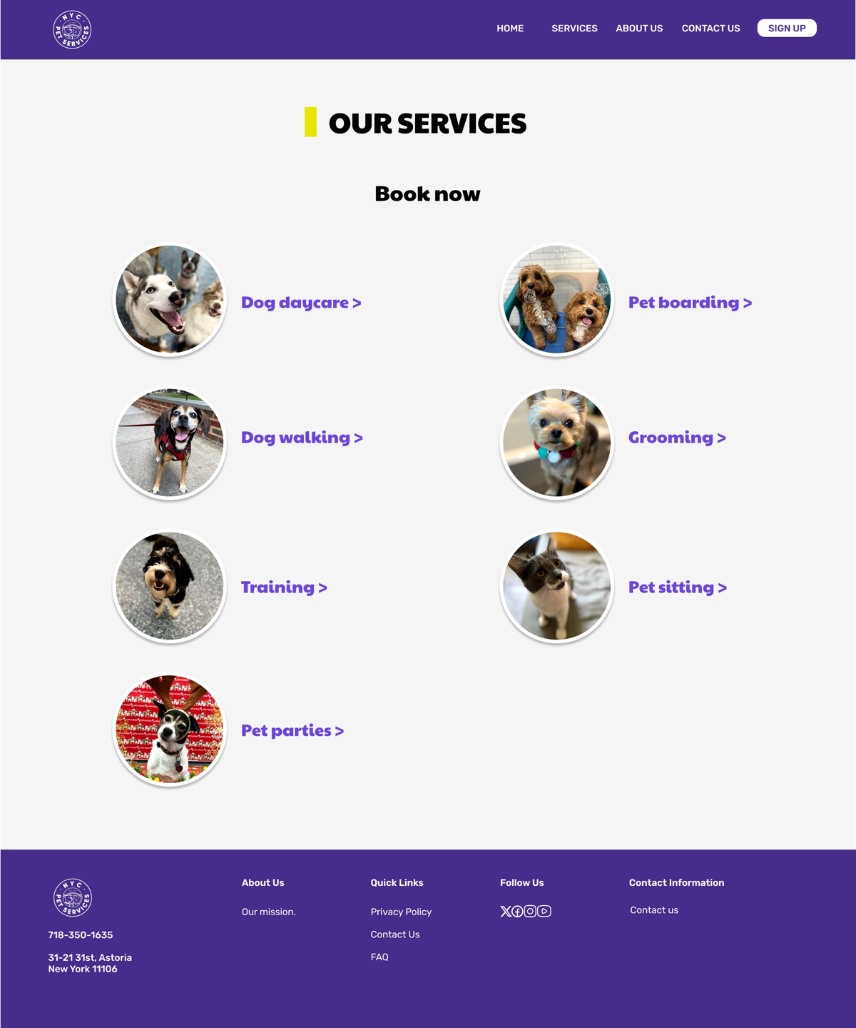
Final UI Adjustments
Most participants gravitated straight to the CTA, so I created an additional dedicated page for it. I also redesigned the homepage to improve spacing and updated the card components.
A new dedicated services page, added after user testing.
Interactive prototype
The prototype walks the full flow - from landing on the homepage through service discovery to completing a booking - on both desktop and mobile.
Desktop prototype
Mobile prototype
Learnings
What I took away.
01
Branding consistency builds trust
Unifying logos, colors, and type had an outsized impact on credibility - even before users engaged with content.
02
Social proof needs prominence
Moving testimonials from a buried subpage to the homepage dramatically increased confidence. Placement matters as much as content.
03
Online booking is table stakes
Users expected 24/7 booking. Its absence didn't just inconvenience - it made the business feel outdated.
04
Responsive design changes behavior
With a properly responsive site, users explored more services. Removing mobile friction unlocked demand that was being lost.